| 6.1
Interpreting Graphs and Diagrams |
|
| Printable |
 |
 |
 |
 |
 |
 |
 |
 |
What Do You
Already Know? |
Methodology
Your Turn |
Demonstrate Your Understanding 1 |
Demonstrate Your Understanding 1 |
Hardest
Problem |
Troubleshooting |
Learning to Learn
Mathematics |
Assessing Your
Performance |
|
|
|
|
|
|
|
|
|
|
Discovery
|
|
Examine the graphs presented on
THIS WEBSITE.
Had you seen all those graph types previously? Which were new? What are some commonalities among all of the
graphs? What types of graphs were presented? Could you intuit
how each graph type might be used, given the layout and text?
|
|
Reading
|
|
|
| Resources |
|
|
|
Methodology |
 |
 |
Sample
graphic analyzed through the
Methodology for Interpreting a Graphic |
Sample
Application:
Your Turn graphic |
|
| Oops! Avoiding Common Errors |
|
|
|
1. |
Making an inference about context, when the
context wasn't developed |
| |
|
| |
|
|
Example: |
Why? |
|
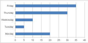
Fridays and Thursdays are more important than
other days of the week.

(Click to see graphic at full size.) |
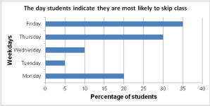
Trying to
guess the meaning of graphics without proper
labeling of the graph - e.g. without a title,
axis labels and a legend can cause false
inferences. The reader cannot put this graph in
context without effective labeling. Note the
difference in the graph below and the
interpretation that can be made with the
labeling provided.
 |
|
|
|
|
|
|
|
2. |
Misleading graphs |
| |
|
| |
|
 |
|
Example: |
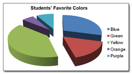
According to the information displayed in the following graph
which color is the students' favorite?
|
|
Why? |
Upon first glancing at the graph, the answer is green, however,
when reading the legend the answer is actually yellow!
Graphs should be simple and easy to interpret.
|
|
|
|
|
|
|
|
3. |
Making
assumptions about the data being used
|
| |
|
|
Example: |
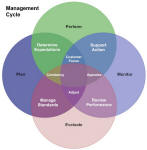
You spend the same amount of time planning,
performing, monitoring, and evaluating, thus the
time spent appraising, adjusting, and
experiencing constancy are also about equal.
(Click to see graphic at full size.)
|
 |
|
Why? |
This is a conceptual graphic helping us see relationships and
the intersection between management functions (e.g., constancy
comes from having a strong plan, clear expectations and
standards and performance desired to meet the expectations). We can't
make assumptions about the graphic to obtain an
interpretation that we want.
|
|
|
| Models |
 |
 |
 |
 |
Model 1
Line
Graph of a Bike Ride |
Model 2
Pets
and Owners |
Model 3
Sales
and Commissions |
Model 4
Flowchart: How to Make Toast |
| |
|
|
|
|
Demonstrate Your
Understanding
|
|
|
1. |
Interpret the Line Graph
of a Bike Ride in Model 1 and document your use of the
methodology for Interpreting a Graphic, step by step. |
|
|
|
|
|
|
2. |
Choose 5 different types of graphics that are new to you that
are presented in
THIS WEBSITE.
| a. |
State any issues with the graph’s presentation and why they are
an issue. |
| b. |
Discuss the (possible) interpretation of each graphic. |
|
| |
|
|
| |
3. |
|
Interpret the graphic ar right
with an additional challenge: Create a set of 10 tips
for interpreting any graphic.
(Be sure to
click to view the full-size graphic.) |
 |
|
|
|
|
| Troubleshooting Solutions |
|
|
1. |
Julian was tasked with documenting his expenditures over
the period of a month and demonstrating them with a pie
chart.
He explains, "This pie chart is a breakdown of
my monthly spending. I spend 20 percent of my
disposable income on clothes, 15 percent on
food, 30 percent on video games, 10 percent on
gifts and 15 percent on music. Since I am able
to save 10 percent of my monthly budget I am
doing a good job of prioritizing my spending." |
 |
|
|
|
|
|
|
|
2. |
Patsy found a flowchart that she believed made it very
easy to make the right decision when faced with an
important social issue.
|
 |
|

